As assignment day is looming ever so near, I thought I had managed to get everything sorted and to submissiom standard. However the road to success is never a straight flat road as I have found out.
After the feedback meeting on Thursday this did nothing but throw up a few errors in my work and missing pieces. This felt annoying at first and made me panic again... but it has to be said that I will do a better assignment afterwards. I did think that the major part of the assignment was completed and to be honest it still is but there is still a little thought nagging at the back of my mind that it might not get finished in time.
The first hurdle to face is the fact that a website used to retrieve images has said that their images are the property of the creator and cannot by copied. This means that I have to search for the remaining images that were found on said website.
The second is the Back to BASIC assignment, this needs some tweaking although all the references are in place and so are the figures [image figs]. The only thing that needs to be done is the Budget Statement and now a table on the website hosts displaying which will be the best to use.
On the A4 assignment front all that is needed now is to print the colour images out and finish the image restoration exercise. I didn't think that I would complete the two essays as good as I have as I didn't really know what to write in the assignment and this is why I think they were left until the last minute.
The final exercise is to complete the two evaluations but with all the problems I think that I will have enough to write.
Thursday, December 14, 2006

Thursday, December 07, 2006
'Every Superhero Needs a Sidekick'
On Wednesday I was greeted with 'a new best friend', in the form of a Spongebob Toy. I managed to get my screen designs started and nearly completed, but another bomb was dropped when I discovered that images count as content.
I quite enjoyed Thursdays lesson as we started with a quick fire 'art attack' kind of session. We were asked to draw 6 wide skyscraper layouts and 6 medium rectangle shaped banner ads in our sketchbooks. We were given 2 minutes to draw 6 rough designs for the banner ad assignment, per photograph. I found this daunting at first but found it really exciting to do and, in the end, discovered I had completed the bulk of this last assignment task.
I feel my artistic qualities could be better but that is something I'm wanting to work on. The final designs that I came up with were interesting but a little hard to explain on paper. I have shown an image below to try and show what the effect I was after was in the form of a single sleeve from U2.

I quite enjoyed Thursdays lesson as we started with a quick fire 'art attack' kind of session. We were asked to draw 6 wide skyscraper layouts and 6 medium rectangle shaped banner ads in our sketchbooks. We were given 2 minutes to draw 6 rough designs for the banner ad assignment, per photograph. I found this daunting at first but found it really exciting to do and, in the end, discovered I had completed the bulk of this last assignment task.
I feel my artistic qualities could be better but that is something I'm wanting to work on. The final designs that I came up with were interesting but a little hard to explain on paper. I have shown an image below to try and show what the effect I was after was in the form of a single sleeve from U2.
This is not so much meant by the background image but I do like the text as some letters are capitalised and some are lower case. This also shows a form of contrast in the different case of letters and colours. I also like the lines behind but I have to be wary with the file sizes. This image may even find its way into my sketch book.
Last but certainly not least is the fact that assignment hand in date is looming ever so closer. Feelings of panic are starting to set in and I can see the weekend being taken up with a lot of work, as self study hasn't been efficiently used the 16 hours and it is starting to show the effects of this. This is my own fault and I know that so tonight on the train home will envolve a little 'list making' exercise to see what needs doing and then organising it into a routine to stick to.
I can see this list getting quite long but not as long as my Christmas list, hopefully! I have an extra day off this week so that gives me another day to do some work.
Thursday, November 30, 2006
'The Clone Saga'
Finally the part of the Assignment I'vae been looking forward to and I have to say I was petrified to see it. We are to take an old photograph and restore it to it's original colour state. Having never really used Photoshop I felt overwhelmed by the amount of work that I thought had to be done. For the best part of Thursdays morning lecture I was a bit unsure on what to do and where to start.
After dinner time, and a bit of coaching from Steve, I felt that I had a better insight on what to do and looking back at the original I feel I have made some progress. I think the main reason why I started to panic was because I was unsure about how I would tackle the task. After a lot of 'Cloning' a bit of 'Spot Healing' and 'Patching'. I feel I am quite happy with what I have managed to achieve at this point but there is still a lot to do.
Going back to Wednesday I feel I got a lot done, content and thumbnail wise. I originally opted for a simple website design with a left hand navigation and whilst browsing the Internet for terms I came across this website.
http://www.gpeters.com/color/color-schemes.php?search_term=computers
This site extracts colour from a related image search and creates customised colour schemes. I had decided to focus on a more blue / silver / grey colour scheme, although a cold colour scheme I feel it also has a technological feel. Another design I was leaning towards was a cartoony / comic feel to the website but after discussing it in the feedback meeting it seemed to be aimed at users a bit too young. I'm not going to totally dismiss the idea and I might develop it a little more in my sketch book.
Self study now will consist of completing a primary draft version of the restored photo so expect to see it on the Blog next week.
After dinner time, and a bit of coaching from Steve, I felt that I had a better insight on what to do and looking back at the original I feel I have made some progress. I think the main reason why I started to panic was because I was unsure about how I would tackle the task. After a lot of 'Cloning' a bit of 'Spot Healing' and 'Patching'. I feel I am quite happy with what I have managed to achieve at this point but there is still a lot to do.
Going back to Wednesday I feel I got a lot done, content and thumbnail wise. I originally opted for a simple website design with a left hand navigation and whilst browsing the Internet for terms I came across this website.
http://www.gpeters.com/color/color-schemes.php?search_term=computers
This site extracts colour from a related image search and creates customised colour schemes. I had decided to focus on a more blue / silver / grey colour scheme, although a cold colour scheme I feel it also has a technological feel. Another design I was leaning towards was a cartoony / comic feel to the website but after discussing it in the feedback meeting it seemed to be aimed at users a bit too young. I'm not going to totally dismiss the idea and I might develop it a little more in my sketch book.
Self study now will consist of completing a primary draft version of the restored photo so expect to see it on the Blog next week.
Thursday, November 23, 2006
'Keeping Cool Under Pressure'
I have only two phobias in life, one is walking under train bridges and the second is presentations. So to my horror, when I walked in on Wednesday, I found we had a 2-3 minute mini-presentation to complete, although I did not expect the deadline to be as soon as 2pm the same day.
I have never liked doing presentations so hearing that we had one started of my primary reaction of panic. In the past presentations have always ended up with me being really nervous. This is due to the fact that I have never really planned for one properly or rehearsed them.
The presentation given was on the colour blue so in order to do the presentation I needed to research. That was the easy part... I think the initial panic had faded by then partly because I had tried to forget about the fact that a presentation was closing.
Research and presentation prepared I went off to do my presentation and to my delight there was only Steve and Diane to watch it. Still this did not stop the nerves and as soon as I walked through the door my heart rate doubled. My main aim for this presentation was not to deliver it too quick because when I panic I do tend to speed up when talking.
During the presentation I felt very nervous and I felt my words wavering and my voice shaky. What surprised me the most is I managed to get the presentation bang on 3 minutes. What surprised me even more was the fact that I had delivered, according to Diane, an excellent presentation. Even Steve said it was a good presentation and if I was nervous I definitely didn't show it. Well I couldn't have felt happier knowing that a) it was over and b) it was a good presentation, which did throw me so much that I completely forgot about my handout.
This has shown me that although I may be nervous my presentation skills have improved more than I thought they would have. The main thing that I need to work on is the preparation of the presentation and how to handle my nervers. In future presentations I am going to need rehearse more, doing this will calm me down.
I have never liked doing presentations so hearing that we had one started of my primary reaction of panic. In the past presentations have always ended up with me being really nervous. This is due to the fact that I have never really planned for one properly or rehearsed them.
The presentation given was on the colour blue so in order to do the presentation I needed to research. That was the easy part... I think the initial panic had faded by then partly because I had tried to forget about the fact that a presentation was closing.
Research and presentation prepared I went off to do my presentation and to my delight there was only Steve and Diane to watch it. Still this did not stop the nerves and as soon as I walked through the door my heart rate doubled. My main aim for this presentation was not to deliver it too quick because when I panic I do tend to speed up when talking.
During the presentation I felt very nervous and I felt my words wavering and my voice shaky. What surprised me the most is I managed to get the presentation bang on 3 minutes. What surprised me even more was the fact that I had delivered, according to Diane, an excellent presentation. Even Steve said it was a good presentation and if I was nervous I definitely didn't show it. Well I couldn't have felt happier knowing that a) it was over and b) it was a good presentation, which did throw me so much that I completely forgot about my handout.
This has shown me that although I may be nervous my presentation skills have improved more than I thought they would have. The main thing that I need to work on is the preparation of the presentation and how to handle my nervers. In future presentations I am going to need rehearse more, doing this will calm me down.
Thursday, November 16, 2006
'You're Looking Rather Green Mr Osborn...'
This week added some colour into my life in the form of the Colour Wheel. Wednesday started with a lecture about the colour theory which had us in our feedback groups 'discussing emotions and feelings linked with colour'. i.e. White as a sheet, seeing red, green with envy etc.
Having previously done a graphics course I have already heard of the colour wheel but I did learn some new terms used such as Triadic and the Tetradic colour schemes.
Thursday's lecture focused on compressions of images which helped a little on the assignment, however my brain has hit the eh? what? stage yet again. I don't really know what I am writing only that I am comparing the image compression formats GIF, JPEG and PNG. I guess I have an idea of what I'm meant to be writing. I think that it's just the word count that is a bit off-putting.
Apart from that assignment A3 is going well I have a good set of achieveable goals. Everything seems to be going to 'plan', assignment 4 is worrying me a bit but I just need to focus more. Self study is starting to be a bit of an issue what with work messing up a few days last week but now I have 3 days to nail A4 part 1+2 allowing more time for A3 to get done.
Having previously done a graphics course I have already heard of the colour wheel but I did learn some new terms used such as Triadic and the Tetradic colour schemes.
Thursday's lecture focused on compressions of images which helped a little on the assignment, however my brain has hit the eh? what? stage yet again. I don't really know what I am writing only that I am comparing the image compression formats GIF, JPEG and PNG. I guess I have an idea of what I'm meant to be writing. I think that it's just the word count that is a bit off-putting.
Apart from that assignment A3 is going well I have a good set of achieveable goals. Everything seems to be going to 'plan', assignment 4 is worrying me a bit but I just need to focus more. Self study is starting to be a bit of an issue what with work messing up a few days last week but now I have 3 days to nail A4 part 1+2 allowing more time for A3 to get done.
Thursday, November 09, 2006
'I Need More Arms'
Time planning has to be sorted, I was with the understanding that they had to be done weekly but apparently there needs to be one that starts on the Issue Date and ends on the Submission Date. As this is a merit criteria I have swiftly amended it, or have started to. As it stands it looks like i'm not good at juggling. This is probably down to the nerves of the last assignment and the thought "Can do better".
Wednesdays lesson focused on Layout Principles, the four main being
1) Proximity - Where the Page Elements are placed
2) Alignment - How they are aligned (Not Centred)
3) Repetition - Consistency
4) Contrast - Differences between page elements
Not completely sure about the contrast bit but that could be some self study, as if I don't have enough. Rest of the day was assignment work.
Thursday turned out to be a 'Mini Adventure' but without the Mini. In it's place was a rather big green bus with a bit of a smoking problem. Sat on the back seat coming into Selby thick white smoke came out of the back seat, well I've never got off a bus so fast. Bus driver quote when I told him "Oh my god it is!"
Eventually got to college a bit late (sorry) and walked into a lecture on colour space and the different ways to show a colour. Hex, RGB, CMYK. Then a quick quiz which I failed miserably 1 out of 3 showed that I need to re-read my notes.
Anyway self study for this week is to finish of The Designers Republic essay and do a fair bit on the Back to Basic web plan. I feel I know what I'm meant to be discussing in this essay after the feedback session on Thursday, although the addition to the assignment brief.
"A particular fruitful approach may be to investigate the margin between 'Art' and 'Design'."
To which my brain said eh? what? Now I feel I can answer this better than I could have done last week. It did however spark off a good discussion in the lesson which was quite amusing to listen to.
Wednesdays lesson focused on Layout Principles, the four main being
1) Proximity - Where the Page Elements are placed
2) Alignment - How they are aligned (Not Centred)
3) Repetition - Consistency
4) Contrast - Differences between page elements
Not completely sure about the contrast bit but that could be some self study, as if I don't have enough. Rest of the day was assignment work.
Thursday turned out to be a 'Mini Adventure' but without the Mini. In it's place was a rather big green bus with a bit of a smoking problem. Sat on the back seat coming into Selby thick white smoke came out of the back seat, well I've never got off a bus so fast. Bus driver quote when I told him "Oh my god it is!"
Eventually got to college a bit late (sorry) and walked into a lecture on colour space and the different ways to show a colour. Hex, RGB, CMYK. Then a quick quiz which I failed miserably 1 out of 3 showed that I need to re-read my notes.
Anyway self study for this week is to finish of The Designers Republic essay and do a fair bit on the Back to Basic web plan. I feel I know what I'm meant to be discussing in this essay after the feedback session on Thursday, although the addition to the assignment brief.
"A particular fruitful approach may be to investigate the margin between 'Art' and 'Design'."
To which my brain said eh? what? Now I feel I can answer this better than I could have done last week. It did however spark off a good discussion in the lesson which was quite amusing to listen to.
Thursday, November 02, 2006
'Between a Rock and a Hard Place'
Well this week has been interesting, firstly we received the results of our first assignment and I am glad to have passed both. Unfortunately we were issued with 2 more assignments meaning we now have to juggle 3 assignments all at the same time. This will be the true test of character, to see whether I can keep them up in the air long enough, or whether I drop them at the first hurdle.
The 3 assignment issued is a web plan, like the last one, but now we need to add the content to the plan as well. Images for this site are now an issue as I will either need to find a free source of images or I will have to beg companies to borrow the images for an educational use. First impressions are that it's another web plan but this time it's leading on to actually making a website so I guess it's not so bad. "Back to BASIC" is the assignment and I am to develop an educational website to help people understand some computing terms.
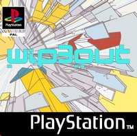 Assignment 4 is the assignment I have been eagerly anticipating, now that I've got it I'm not so sure. The assignment name is "Picture This" and implied that we would be using PhotoShop, but in actual fact we will be using it for design in 2 parts of the assignment. The other 2 parts are reports but I guess it's a start on the long road of PhotoShop... I have started the first report and I have to compare a Vector and a Bitmap from The Designers Republic. I have found one image that I think is a vector image and this is from the Playstation series Wipeout which I have played and thoroughly enjoyed.
The last assignment that has been unfortunately neglected is the Sketchbook assignment. I was supposed to look into sources of inspiration and I will now have to start filling the sketchbook with these, annotating where necessary. Sources of inspiration can include Magazine Cuttings, Artwork, Screen Designs and Layouts, Colour Schemes and Typography.
So far I have added the drawing book image to the Blog and it was mentioned that we could create an "Online Inspiration Portfolio". Although, like I said, this was just mentioned and may need some further discussion. As for typography I did find a font which I used for my folder design and my CD design and should be a recognisable font.
The 3 assignment issued is a web plan, like the last one, but now we need to add the content to the plan as well. Images for this site are now an issue as I will either need to find a free source of images or I will have to beg companies to borrow the images for an educational use. First impressions are that it's another web plan but this time it's leading on to actually making a website so I guess it's not so bad. "Back to BASIC" is the assignment and I am to develop an educational website to help people understand some computing terms.
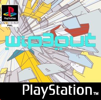 Assignment 4 is the assignment I have been eagerly anticipating, now that I've got it I'm not so sure. The assignment name is "Picture This" and implied that we would be using PhotoShop, but in actual fact we will be using it for design in 2 parts of the assignment. The other 2 parts are reports but I guess it's a start on the long road of PhotoShop... I have started the first report and I have to compare a Vector and a Bitmap from The Designers Republic. I have found one image that I think is a vector image and this is from the Playstation series Wipeout which I have played and thoroughly enjoyed.
The last assignment that has been unfortunately neglected is the Sketchbook assignment. I was supposed to look into sources of inspiration and I will now have to start filling the sketchbook with these, annotating where necessary. Sources of inspiration can include Magazine Cuttings, Artwork, Screen Designs and Layouts, Colour Schemes and Typography.
So far I have added the drawing book image to the Blog and it was mentioned that we could create an "Online Inspiration Portfolio". Although, like I said, this was just mentioned and may need some further discussion. As for typography I did find a font which I used for my folder design and my CD design and should be a recognisable font.
Subscribe to:
Posts (Atom)