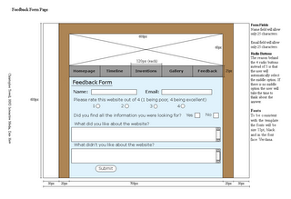
The main task for this week was to complete the Template and the Feedback form designs from the none-digital designs. I found this to be a bit difficult at first but as I've already said practice really does make perfect, or at least I'm on my way. I had one or two problems though, the first being that I couldn't get the images right on the page. I wanted a wooden effect for the background of the website layer but, as I don't know PhotoShop that well, I gave up on the idea when my cloning went a bit funny.
Yesterday we had another visit from Diane, an ex student who now designs quite regularly, she sat down and had a chat with us individually and gave us help and advice. It was interesting talking to someone who had completed the course and done the work and she was really helpful.
Friday's discussion group went okay I got a bit of constructive criticism which has helped me and showed me that I need to adapt my designs. Below is my final screen design, minus the header image, I feel that this is a good achievement to say I have never really used PageMaker.
 Self study I guess is just making the changes to the screen design master template and creating the header. After that it will be a case of getting everything ready for next week and to make sure it is all correct.
2 comments:
Tasty design Chris. I like the vertical style website a lot more than a horizontal one, and it seems like a lot of people haven't done these kind of websites for this project.
Thanks for feedback. I felt that I couldn't fit it all on in a horizontal website and this design was the most appealing to me.
Post a Comment