Wednesday, December 12, 2007

Trexi!

Culture Vulture
This assignment has been by far the hardest assignment I have ever done. The 'Reverse Design' process did seem a little daunting and all through the assignment I was wondering what the product was. With the previous two year's being the Coke Bottle, I was hoping that we did not get this as I thought it might be too easy. Going through my designs now though I do not think I have a design that would suit it.

The two product choices were a bit cryptic as I guess they were supposed to be in order to hide it. I originally chose number 2 which seemed the easiest choice, but in the end I chose 1, "A niche product, Child's play? no way! Urban Vinyl", as I thought what if it is the Coke Bottle? I guess I would have chosen quicker had I have 'googled' it.

It was quite a nervous situation last Wednesday morning having turned up to the room early only to be turned away by Steve. At 9 o'clock we all got ushered in and then those who picked number two had to leave for half an hour. Thankfully though it was only to show us our product.

I am happy with the product choice which happens to be a collectible item known as a Trexi. I am quite a collector of things and have already purchased my first Trexi which is the Godzilla/Dinosaur design. I think the week before receiving this 'product' I was beginning to get tired of the constant creative work. As soon as I saw the product I think I got a new burst of enthusiasm. This week has been the 'apply it to the product week' and I have found Freehand to be an amazing tool, making the 'difficult' bits look easy. Saying that I still have to do the fish on the front of my design and make sure it looks right in the perspective.

I decided to do the skeletal design for the website last week as then it is just a case of dragging and dropping an image into place. I kind of knew which idea was going to be created so I wrote the content to suit it and having looked at the Freehand design I can clearly see it is the best of the 3.

It is a bit scary having an assignment hand in date close to 7 days away as there is still a bit of work to be done but hopefully this time next week it will be over!

Things that need doing for this assignment
  • Draw the Fish – all will become apparent soon...
  • Finish the Collector Card – Should finish before 5 tonight
  • Finish the 'Mini Site' – Just a case of finishing the design off
  • Evaluate! – Evaluate assignment
One thing I would like to add is that I would prefer to have 2 weeks creative and 3 weeks build as there is a lot to do in the build exercise. Saying that I have managed to nearly complete the design in a day so I am not doing too bad.

On the Job!
I will be glad to finish this assignment as I feel it may have drawn out a little bit too much. I have enjoyed it though and it is something to add to my Portfolio. I think it has turned out a lot better than I had originally expected.

I think the assignment has gone well though as everything has been finished or is near finish. The assignment has been managed effectively by Scott and there are lots of things that I may have missed had I been the Project Manager. Tomorrow is the client sign of date and feedback and we also need to give a copy of the website to Dean and tell him what needs adjusting and what needs updating.

The only thing that should need sorting out is the folder which can be done tomorrow hopefully by the end of tomorrow the team assignment will be done and dusted so I can concentrate on the Culture Vulture assignment.

I have enjoyed this Semester and am looking forward to finally being 'forced' to use Flash. It is scary that in 6 months time this course will be over and I will be looking for a job in the industry but in a way I am looking forward to doing this as I am happy designing and it was I've wanted to do for ages.

Wednesday, December 05, 2007

Skillset vs BTEC

For the past two weeks I have been given the task of becoming familiar with the Stndards set by both BTEC and Skillset. It is now my task to compare and contrast the two.

The first major difference between
Skillset and BTEC is the size of the document, BTEC having 198 pages and Skillset having only 41. The main reason behind this is because BTEC goes into more pages about a unit giving us an idea on how it should be delivered, BTEC also gives Goals on what will be learnt through the units. Skillset is set out in a table making it easier to understand and shows the 'Knowledge and Understanding' , 'Awareness' and 'Performance Statements'. I personally see this as being easier to understand compared to the BTEC standards and having them on the same page helps keep everything together.

Skillset seems to be more on the 'Technical' side saying that we should learn more coding languages including PHP. I for one would like to learn PHP as I see it as it is a skill that is highly sought after in IM Careers. The Skillset standards also help with life skills including communication and time planning. I don't think that all of these skills could be taught in the two years that I am on the course but I think that it could be handy looking at the units we will not get to do and seeing if I can meet the requirements. It is a shame that we cannot do some of these units as I am interested in some of the units and would like to pursue some of them.

The Skillset standards however do generalise themselves to one specific area/job, which in some places of employment can be accurate when the work force is substancially large. This is handy though as it shows the skills that are needed for a specific role but when the work force is a small team of about 5 people you may find that the roles swap and some people may find themselves with out work to do. So it is common that people will learn more than one set of skills for the job.

Personally if I were to go into a Interactive Media post I would make sure I had learnt about different areas e.g. Coding, DTP, Image Manipulation and Animation, as this would make more accessible to work in a variety of roles.

The information on the BTEC is sometimes seen as old and outdated making it harder to clearly add to an assignment. Some sections have to be re-worded/worked to make it clearer to complete. Skillset on the other hand is updated more frequently and has been updated in the last week.

Personally I think that the Skillset are the most relevant as these are up to date and more relevant because they include coding units and BTEC do not. I believe that coding is a big part of our job and would have liked to learn PHP and mySQL.

Friday, November 30, 2007

Interlude...

As requested here is the CD Tracklisting for my Culture Vulture CD. I had noticed whilst listening to it that most of the songs are from Soundtracks so I will also add where they are from.

  1. Chelsea Dagger - The Fratellis
  2. Battle in the Forgotten City - Uematsu Nobuo - Final Fantasy VII: Advent Children
  3. Stop the Rock - Apollo 440 - Gone in 60 Seconds
  4. He Wasn't - Avril Lavigne
  5. Life is a Highway - Rascal Flatts - Cars (Disney Pixar)
  6. The Bartender and the Thief - The Stereophonics - Gran Turismo 2
  7. The End of Heartache - Killswitch Engage - Resident Evil: Apocalypse
  8. Trouble - Shampoo - Power Rangers: The Movie*
  9. Canadian Idiot - "Weird Al"
  10. The Night Santa went Crazy - "Weird Al"
  11. Feed the Addiction - Ils - NFS Most Wanted
  12. Signal Fire - Snow Patrol - Spider-Man 3
  13. Hoppípolla - Sigur Rós
  14. Those Who Fight Further - Uematsu Nobuo - Final Fantasy VII: Advent Children
  15. Chase of the Highway - Uetsu Nobuo & Kawamaori Keiji - Final Fantasy VII: Advent Children

I really like the last two tracks which are instrumentals and they are from the best parts of the Advent Children film. 14 is from the scene where Cloud & Co. are fighting the Aeon Bahamut and 15 is from the scene where Cloud is involved in a highway chase on motorbikes whilst sword fighting Loz and Yazoo.

*Yes I am ashamed to know this...

Monday, November 19, 2007

CS3 Scandal??

Looking on the Amazon.co.uk website for a legal copy of the CS3 Master Collection (looks brilliant and extra software could come in useful) found to cost £2,029.98. A lot? Definitely, Worth it? So far...

Having read a couple of reviews it appears it would be better to buy this from the Amazon.com store as it is
$2,342.49.

Thats just over half the price in converting to English Pounds Sterling but Amazon.co.uk sell it for just under the same value but in £££. So A lot? YES, Worth it? No from there...

Just a warning for anyone intending to buy the legal version.

Wednesday, November 14, 2007

Colours. As Nature Intended

Blue & Green? – Bliss!Colours play a significant part in our lives. There are two colours that stand out for me and these are "Blue" & "Green". There are many colours but only some that go together in harmony and none better than "Nature's Finest".

These colours can be seen everywhere in nature green grass and blue skies. Green trees still blue water.

I can't think of single more successful or more seen colour scheme and works well anywhere. Blue for example is the colour of trust and honesty and green is the colour of rest and relaxation. So together your viewers can have a calm and relaxing experience and can be safe in the knowledge that they are viewing a safe and trustworthy website.

On a final note one Marvel-ous example of this colour scheme would be the powerhouse that is the Hulk, often seen wearing blue shorts on top of his green skin. So this is my favourite colour scheme and quite possibly the best one to use.
(Image from Windows XP)

Wednesday, November 07, 2007

A Day in the Sculpture Park

Today we went to the Yorkshire Sculpture Park. Having never been to a sculpture park I was slightly sceptical about the productivity of this excursion. I have to admit I truly enjoyed walking around taking pictures and taking in the culture.

The exhibit I liked the most was one made entirely of logs self-supporting each other in the shape of a hut. Unfortunately I could not get a photograph of this as photo-taking was banned in that block. It looks like a tremendous amount of time has gone into it and just proves that some art is actually really good. I am now more appreciative of art and methods and thinkings behind it and it is not just thrown together in a couple of hours. It does however provoke the question is it art or was it designed prior to making it. I think that there is some design to it but it is truly creative.

I was really inspired by the art work/sculptures in most of the exhibits but me and Julian spent more time outside taking photographs of the natural surroundings. All in all we had an inspiring day taking lots of photographs of the surroundings, trees, sculptures etc to try and to get some textures for the Culture Vulture assignment. Below are a few of the pictures that I have taken today.

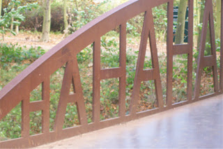
The HAHA BridgeI thought this was an interesting sculpture as the sides repeatedly say haha. What you cannot see from this particular angle is that it curves inwards at the middle of the bridge giving it an almost hourglass shape.
Metal Retro FuturismI think this personally reminds me of Retro Futurism. It is the overall design and the straight edges and cylindrical elements that, to me, make it look as if it belongs in an old space film.
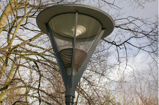
Space LampostI am aware that this is a lamp/light but I till think it has an "Arty" quality to it. once again it reminds me of what the future was always conceived to look like by now. I like the curvy design and personally it looks like a huge light bulb.
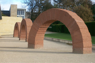
Stone Arch WaysUp close these are very impressive and really tall. These were a set of three and by the looks of it made out of individual blocks of stone. It was quite scary stood underneath as you never quite know how safe things are, although I guess they'd have to be or it wouldn't have been displayed. I think I spent more time photographing the surroundings instead of the sculptures but thoroughly enjoyed pointing and clicking with a different device. Even if some do not get used for this assignment I have a starter library of stock photos.

I think this was a welcome contrast to this morning's presentation which went a lot better than I thought it would. When it comes to presentations I tend to get nervous but not this time, I did stumble on a few words but managed to present what I thought a good presentation which lasted the 5 minutes including one question.

As I have previously stated the Icon I chose was the Nintendo Game Boy. When I asked Steve if he had any questions it was a bit of a surprise as he asked why I chose that as an icon and did I have anything else in mind. To be honest I chose the Game Boy as it has had nearly a 16 year lifespan and no other games console range has lasted that long.

Another icon I was thinking about was the Shelby Mustang GT 500 which is Eleanor from the film Gone In 60 Seconds. I do really like this car, in fact my dream car which I will never be able to afford but will always long for it to be parked on my drive way. I decided not to do this as I do not really have any knowledge of cars or why it was such an Icon.

So in the end the Game Boy Classic won!

Saturday, November 03, 2007

A Spot of "Trouble"

As per Steve's request in the previous post comments I have a some what special song choice to add to my CD.

This is due to the fact that in reading week I woke up a bit late on the Wednesday (9:30am) and was told as a punishment I had to add a song because I was in Trouble.

As you have probably guessed I am required to add Trouble by Shampoo to my CD! This cost me 78p from iTunes (sourced as requested by Steve).

Apologies in advance.

Wednesday, October 31, 2007

3 Songs

For the Culture Vulture assignment we have been given the sub task to create a CD. As a listen while you design exercise we are to create an hour long CD to listen to while we do the creative work. This blog is to pick out the 3 main songs and

My first choice is the Bartender and the Thief by the Stereophonics. This is probably the first song I heard from them and got me into them. Taken from their second album Performance and Cocktails this song has always stayed with me and is the song I wanted to hear most when I went to see them live two years ago in October.

Signal Fire - Snow Patrol. This is an obvious choice as it is the first song from the Spider-Man 3 soundtrack and possibly only one of the two songs I actually like on the CD. Everytime I hear this song I immediately think of the film. It was also used as the music for the credits.

The End of Heartache - Killswitch Engage. Im not really into screaming shouting music and this is what I heard this band to be. It now is one of the most listened to songs on my iPod and is the credits music for the amazing (but could have been better from the game point of view) film Resident Evil Apocalypse. I think this is the perfect song to end this film with.

Wednesday, October 24, 2007

Evaluation of Year 2 so far...

This first semester back has, like all the rest, flown by. So far I don't feel any difference between this year and last except in the team assignment where we have more control over what we do for when. The two assignments given so far have been A9 Box Clever and A11 On the Job.

Box Clever
I enjoyed doing the CSS Box Clever assignment but still got all the "Will I pass nerves?". I enjoyed creating the CSS Beauty page as it really showed me what CSS is capable of. I managed to turn a very dull looking print page into an interesting CSS Styled page. I found it quite interesting looking into the impacts of CSS and what its benefits are. Starting this assignment I had some degree of knowledge of CSS, (I thought more) but learning how to code CSS cleanly was an interesting experience and using the proper code was useful.

On The Job
I am enjoying this assignment as I get to create an online multimedia project for a client in a team. As the developer I am now coding the website and am finding it relatively easy using CSS. This assignment was a little slow in starting as the client was a bit hard to get hold of but now we are really beginning to get moving. I liked the idea if having to pitch for the client with a presentation as this is a procedure that will more than likely be soemthing that happens in the design world.

I have found it a bit hard though especially with trying to give the client what he wants and trying to figure out the solution so it is also easy to implement. I think the hardest battle so far was with the CMS which I couldn't get to work.

Out of the 3 available team roles I am happy being the developer and am looking forward to doing the user testing as I would like to see what people think of what we as a team have created.

iMe
I think having a blog topic every week helps is focus on writing the online learning journal. I have enjoyed writing the entries except the one that we had to keep below 100 words. That was hard because I wanted to add extra words here and there but it wasn't allowed. So far I really enjoyed the Job orientated questions as they made you think on your feet. I was interesting reading the answers as well especially the post starting with the "Describe yourself in 3 words?" I completeley see the point of these questions as I see it as character building for the interviewer. I also like some of the more random questions like who is your hero?. I did originally find this hard as I was trying to think of someone from the design industry, and although loosely, mine sort of is connected. Which I didn't see at the time as I just put my hero down as a personal hero.

Looking forward I am looking forward to the Culture Vulture and am currently researching into my Design Icon, the Nintendo Gameboy. It is interesting seeing how much difference the name Nintendo made to the success of the Gameboy as many have tried similar techniques before the Gamboy and failed.

Monday, October 15, 2007

Bills to pay but still no job...

I firmly believe that punctuality is possibly the best characteristic to have as no one likes to be kept waiting, even if it is for the Queen. I always like to arrive about 10-15 minutes early as I think it shows a person who is dependable and enthusiastic.

Although I may tell a few white lies I feel it best to be honest even if people do not believe you sometimes and I like to think that I am thoughtful. In a team I would probably be the person who asks if everyone is okay and getting the drinks in at tea breaks etc.

I don't know if I understood the question right for no2. I assumed by effective it meant does it meet the brief as every design concept from a client will have a brief. I think that if it passes a brief then yes it was successful.

For criticism like I said it totally depends what mood i'm in. If i'm in a good mood i'll take it with a pinch of salt and say thanks and ask for reasons why its not good yet. If i'm in a bad/upset mood I will maybe see it as a personal attack. In genereal I can normally take it ok but I do not like criticism if somebody is saying it just to say it.

I am glad to say I am over the Photoshop issue, looking back I have learnt so much and am still learning. Before opening Photoshop was a daunting thought especially with the Photo Restoration task. To start with I absolutely hated it but when I gave up whinging about it and got down to work I ended up with something that I was proud of.

Team work is something I look forward to and I hope that I am a good team player. I sometimes get angry when people don't pull their own weight or if tasks need doing and I'm working and other members are sat around doing nothing. I have done a bit of group work in past courses and have also worked in retail teams, in which I also had the chance to manage them.

I feel that asking questions in an interview is a good way to show off your interest/enthusiasm about the job. I don't even think there should be a limit to the questions you ask as long as you have already researched into the company and could not find the answers. I think that personality can also shine through when asking questions as I feel I get less nervous as the interview progresses. I am nearly at the point when I'm not really nervous anymore but I can remember my first job interview which was quite terrifying to say the least. Saying that I got the job and worked for their company for 3 years.

Wednesday, October 10, 2007

Second Interview

1. Describe yourself in 3 words
Punctual, Honest, Thoughtful

2. How would you measure the effectiveness of your interactive media products?
It depends on what is meant, in a precise sense you can measure the effectiveness by looking at a counter website which measures the amount of times a website has been viewed. The other sense is does it meet the brief? In this sense I believe that most of my later IM products are effective as they do what the assignment brief required.

3. How do you handle criticism?
I can generally take criticism well, on my work, but sometimes it can be taken badly if I have spent a long time on a piece of work. I am learning to adjust to this and see it not as an 'attack' against my work but more of constructive criticism eventually helping me to create a solution that is best for the task at hand.

4. Describe a difficult problem you have had and how you've solved it
At the beginning of my first year at Wakefield college I knew very little about Photoshop and had barely used it. I took it upon myself to learn it in my own time following online tutorials and now feel I am quite good at using the software.

5. Describe how you fit into a team
In a team I manage to fit in quite quickly and am not afraid to share my views on a project. I have worked in teams before so I am not new to this. I think I bring to the team good ideas and solutions to problems for the task at hand. I am a good coder and designer in Photoshop and Flash so I could partake in a number of roles in the group.

6. Any other questions?

Is there a possibility of promotion?

Will I get the chance to lead my own team?

Will there be the chance to work abroad?

Monday, October 08, 2007

Beauty Is Only CSS Deep

Here it is the link to my CSS Beauty page. Comments would greatfully be accepted thanks.

http://www.chris-towell.co.uk/units/css-beauty/shuffle_page.html

Thursday, October 04, 2007

Honesty builds good character

I enjoyed writing the previous post answering the interview questions. It was good practice and I think that I answered them professionally and honestly. I struggled a bit on the why do you want the job? not because I didn't know what to write but because I didn't know how to word it. I don't think im the best interviewee and sometimes leave them thinking "that could have gone better" but at the end of the day I guess it is just experience and we learn from mistakes.

I found it hard to add a weakness as I thought there were a few I could have put but didn't kow if it put me in a bad light so to speak, but I guess it shows honesty and this is something an employer would definitely want from an employee. If I had to change it I would probably say my presentation skills as they can definitely be developed for our upcoming assignment.

I wasn't surprised by the who is your hero as it is a random question which was meant to throw us, but I think another reason why it is asked is again to give insight into the character and their influences.

There has been the discussion is it okay to lie in an interview part of me says yes but part of me also thinks that the interviewer wants to hear the truth i.e. the real you; as that is the person they are employing + im a crap liar! and chances are something wouldn't add up in the future.

Wednesday, October 03, 2007

Any Work?

The Job: Junior Web Designer
Salary: £16,000 - £20,000


Full time in house designer, will require you to create new website concepts, update existing websites and create online marketing material. Must supply portfolio of existing work, have a keen eye for detail, good communication and good enthusiasm.

Why do you want this job?
I would like to start a career in design. I have been interested in the area of design for some time now and have developed a great interest in it. This job would give me the ability to express my skills at designing and I think I would be a good asset to your design team.

What is your greatest strength?
My greatest strength is the willingness to learn new things. I am someone who would like to learn as much as I can about a subject and try to greater my skills in them. I see this as a strength because I am not afraid to learn if I am unsure about how to complete any given task.

What is your greatest weakness?
I think my greatest weakness is not having much commercial design experience. As I am still studying the HND Interactive Media I have not been able to complete any outside work.

Where do you see yourself in 5 years time?
As I am an ambitious person I would like to progress through the company and eventually lead my own team of designers. Through this I would also hope to have been given the opportunity to open up my own branched team from your company and help the company grow throughout the UK gaining experience as I progress.

What current multimedia innovation excites you the most?
Flash is a multimedia technology that is something that I would like to work with in a commercial environment. This can allow good interactivity for a site and is a way of keeping the user entertained as long as it is used correctly. As I am currently teaching myself about this software this drives my enthusiasm of using the software.

Who is your hero and why?
My hero Stan Lee because of the way he has developed a small company into a world wide brand. His imagination amongst other things has probably been the reason for me wanting to become a designer and feel that I have learned a great deal from him.

Wednesday, September 26, 2007

The Design Mechanics

Their unique selling point is that they have a set price list that does not change per service. A client scope is done at an early stage by a sales representitive so the client never meets the designer. This is a much easier this way as they have the same design knowledge as the client. I have also learnt that although some can be difficult it is the client we are designing for at the end of the day.

According to Dave Pannell in order to gain employment a good portfolio is necessary.

Wednesday, September 19, 2007

Back to the Drawing Board!

The first three weeks have been a totally different experience for me compared to last year. For a start the assignments are a bit harder than last year and there is more emphasis on "do it yourself!" I don't really have a problem with this as I like to just get on with things. Another was the welcoming addition of air conditioning making the room ice cool!

Finding out about the referral for A8 was a bit of a shock as I thought I had done better on that assignment. I understand why and the mistakes were all minor ones apart from the missing evaluation.

I am really looking forward to completing the team project as I am in a team with Scott and Julian. Our team name is Pen to Pix but we did get off to a bit of a false start with the presentation for the project, not really knowing what to expect and not asking the right questions, but we still managed to claim work from one of the clients. I think I am happier developing a sports website than opposed to a nursery but this site does seem to be a bit big on the development side. However this can easily be tackled by the learning of CSS!!.

New to 'Blogs' or sorry Learning Plans was the structured topic for each entry. As you can see this weeks is a Evaluation of the first 3 weeks and I think I'm happier writing when I have a topic now. I enjoyed writing last weeks blog because it felt like a personal evaluation of my skills and made me think about what I have learned over the years.

Box Clever is the assignment I was most looking forward to as it is the first creative assignment of the second year. I did feel the themes were a bit limited from the original theme list but I have decided to go with the "Pencil & Paper" theme. I think this could provide the largest possible range of ideas but also simple ideas.

On the whole this year is shaping up to be a good one and am glad that I'm still on course learning hard. I'm really looking forward to Flash unit and have one or two ideas that could be done.

For the next week I aim to have the creative thumbnails to be completed, starting on any Photoshop documents required and finished Task 1.

And on a final note I have a new job!!

Wednesday, September 12, 2007

Academic skills from the X-Mansion

Academic Skills that will assist me in future job prospects are:

Personal Development Planning
Over this last year, and previous years I have been constantly developing my skills and learning new things to help me gain better employment. This not only means developing with practical skills, but also developing my personal skills. E.g. Listening, researching and presentations. Another skill from this is the ability to self evaluate after each assignment. This is a skill that could be beneficial in the work place as I can self evaluate my work and my performance in order to reach my maximum potential.

Attending Lectures
In lectures I have been able to improve my listening skills, as well as the ability to negotiate my points across when I feel the need to disagree with something. I also believe that this can help with being punctual. Having a purpose of being somewhere gives me the feeling that I need to be there on time or early and as it is something I enjoy I have no problems being there.

Seminars/work groups
Working in a group has obviously allowed me to increase my skills with working in a team. I think that I have also developed the ability to discuss points and argue them if necessary. I feel this is beneficial in the work place as there will be team projects that need to be completed. I also feel that employers like to see people coming to the right conclusion through discussing good and bad points and then adapting them. I can show this skill as I am now undertaking a team project.

Oral Presentation
Under the years I have carried out a series of Presentations and I can say that not all have been pleasant experiences. This is a skill that needs to be developed as there will be times when I need to present work to a client.

Written Essays
The biggest skill I can learn through this is creative or academic writing. This can also develop my use of English and improve my spelling, grammar and punctuation.

Maths Statistics
Statistics can be seen as a way of taking research and managing it. We as designers work with statistics all the time, for example what percentage of users work on a Mac? What percentage of the world have FireFox as their default browser? All this will help us create better websites and cater for the larger target audiences.

Another example is the use of Mathematics in some coding which may be developed as a designer. E.g. ActionScripting and JavaScript.

Observations
Creative influences are everywhere and it is what we see that inspires us. An example of this is animation for me. Whenever I see a film that has great animation it inspires me and makes me think that someday I want to release something just as good or better.

Another skill to add on to this would be attention to detail. For designers this, in my opinion, is a biggest skill some one may need in this industry. I believe that if there is an improvement to be made it should be done up until a point that anymore could degrade the quality.

An example of the use of my observational skills are in the competitive analysis's we complete when developing a site and discussing the strengths and weaknesses of both the sites we create and the sites we are in competition with.

Research
As we do not know everything there is a need to research something be it coding for a Flash project, a way to align a website central on a page or even images to use on a site. This has been a bit of slow starting skill for me as sometimes I do not enjoy researching a topic which I have little interest in.

Exams & Revision
Revision helps us remember things which is an important tool to develop. If you can remember something it takes less time to complete a task than it does if you need to research something. Revision can also aid in the process of Presentations. If you revise and prepare for a Presentation then the worries and panic should be decreased.

On the whole my main weakness is Oral Presentation Skills and instead of embracing them I tend to run from them. The main reason for this is probably my lack of confidence in my public speaking.

Wednesday, September 05, 2007

Into the Abyss

The next 6 months...
Over the next 6 months I am hoping to get at least 4 Merits in the assignments that I complete. I have received passes so far for the assignments I have already completed and now want to push my self to attain at least Merits. In order to achieve this there will need to be a more thorough approach with my time planning and I have now adopted another method for monitoring the learning outcomes. This is in the form of a Checklist started at the beginning of the assignment with all of the learning outcomes on. When I have met one of them I either cross off that particular outcome or, what I think would be better, is add on the reference to where it is in the assignment.

Another personal goal for the next 6 months is to improve my knowledge of some areas in Web Development that I am unsure of.

I am also wanting to complete something in the area of Flash in the next six months to help 'bulk up' my portfolio in my spare time. I am interested in the area of Flash and animation and can use the software but as of yet have not completed anything to show this. I feel that this would be a good opportunity both to show off my skills and add to my portfolio.

As a designer I feel I have grown in confidence but I believe this still needs a lot of work and this could be one of the reasons why I have only been getting passes. So over the next six months I would like to try and improve this.

The next 2-3 years
Over the next 3 years I am wanting to complete this course with at least 4 Merits and above. I aim to be in a design company doing Flash animation work and web development work. Further down the line I would like to branch out on my own and start a Web Design company of my own and develop it into a bigger business.

Monday, May 14, 2007

Learn the Hard Way

Starting this course I knew it wouldn’t be easy for a start my first fear was fitting in as I live the furthest away and I thought that I would be with people who already new each other. This wasn’t the case and I think I fit in well. I am glad to have made new friends among the group and do not think that it matters who’s group I am in next year in the team project.

This could be linked with the fear of not being as good as everyone else. I started this course with little design knowledge and I felt that there would be people better than me, and there are. This, now, no longer makes me feel anxious, it gives me the determination to be the best there is.

Another fear was learning the software I knew that I would be required to learn software that I wouldn’t normally use e.g. PageMaker. This is a big step from anything I have ever used and it felt daunting at first to use. However over the first year I can now say I can use it well enough to complete the tasks so I feel I have enough technical proficiency in this.

One software I desperately wanted to learn was Photoshop which, in my eyes, is a truly amazing software package, however it is very easy to get ‘lost in the moment’ when using it and I found out that you can start with nothing and finish with something and be completely oblivious to what happened in the middle. Banned words in Photoshop include Lens Flare, and for someone else Twirl. I feel that I have learnt this well and I did take the time to try out tutorials for my own learning from the website www.tutorialized.com.

Starting the course I had experience in the software package Dreamweaver and from the previous foundation degree scored the highest in a Vendor Skills Qualification of 63%, pass mark 70%, set up by the course leader, closely followed by the next person at around 20%.

I was surprised to see that Flash was not part of this year. Next year it looks like there will be a six month long assignment in Flash. I have some ideas of what I want to do but I will need to take all aspects into consideration and my current abilities in the software. I am not however going too create an assignment, which is too easy, as I want to push myself to my full potential. On the other hand I don’t want to make the assignment too big so that it is too big to handle.

This course allowed me to create my first website. I was pleased with the overall outcome of it, even though I got a referral the first time. The reason for this was because of images that hadn’t been compressed to the fullest. Having learned from this mistake my Ambient World style guide was a lot better, and created in CSS, which is another achievement.

Deadlines were another fear of mine as I sometimes leave things to the last minute. I haven’t missed one in my train of thought, but a referral seems to count as a missed deadline according to the course leader. I did feel a bit down about referring this assignment but I understood why and got it to a pass.

Self Study started off as a bit slow, I will admit that to start with I may not have put in as much as was required but towards the end of the year I found my self doing more than needed. I could see this as either a good thing or a bad thing. On the one hand it showed I was dedicated to the course wanting to get the most out of it, but on the other side it showed that maybe I was doing more towards the end fearing I hadn’t done enough. I would like to think that it was because I wanted to de better.

Tied in with this would be timekeeping. So far I have not been late for college (of my own fault). My time planning in the beginning was not very good at all. I felt that I couldn’t plan ahead of the assignment deadline, and recording what I had done. I have done a lot better in this last assignment and it is no longer a real issue. I now create an overall plan of the assignment and what needs to be done on a calendar like form. Then plan each week a week in advance.

Assignment Sheets. As being part of the ‘Chipmunks’ group we were often tested on the learning outcomes of the assignments. For example “What’s 4.1?” which mostly up in either silence or a random series of words forming the wrong answer. This has taught our group at least to memorise them off by heart in fear of a ‘pop quiz’ from Steve.

And for anyone wondering what 4.1 is it’s “Use a range of idea generating techniques creatively” but you should know that.

Maybe the biggest fear I have is presentations and something that is becoming gradually easier apparently in the 2nd year we’ll have a presentation every month, which to start with sounded absolutely terrifying but now seems like a good idea. I think this stems from a lack of confidence when speaking and I tend to speed up and merge the words into one big one. The second presentation I think was slightly better than the first because I had planned it more but not practised as much as I could have. Nerves are an issue as well as I can get nervous when put on the spot.

As the design industry is driven by communication, both verbal and creatively, it is something I will need to strengthen and is strengthening all the time.

A1 Sketchblog
This is the first time I have written a blog. Another new thing was keeping a sketchbook. I found that the sketchblog got neglected and it shouldn’t have. I think this is because I did not fully understand the assignment sheet mark criteria. I think I could have found more influences to put in the sketchbook but I think that I have attained a pass for it.

With the blog I tried from about week 4 to have a theme for the blog titles and these were references to Marvel characters, some of them lyrics from songs from soundtracks. For example ‘Learn the Hard Way’ is a song from Daredevil.

A2 That’s the Plan
The first assessed assignment was quite easy now compared to the later assignments. This was our first encounter with PageMaker and to start with it was daunting but over time it got easier and I can now say that I have a greater understanding of the software.

A3 Back to BASIC
This is the first website we created for a website that was going to be built. It did feel a bit repetitive to the A2 assignment but this time the content needed to be supplied. Finding free image sites was a hard task in itself. The content was easy to write as most of the technical terms I knew from previous courses.

A4 Picture This
The first real use of Photoshop, the restoration was quite possibly the second hardest assignment to complete. We had to restore an image from its battered scanned form to a good colour image. I think this was the assignment I was dreading handing in and getting the mark back. However I passed it and felt good about doing so. The main concern was not being able to get rid of the imperfections and this was an example of lack of technical proficiency.

A5 Builder
Taking the website plan from A3 we had to create the website. I have to say I thought that the website would look completely different from the screen design but I was pleased to see it didn’t. I was a bit stunned to hear that it had been referred but I know the reasons why and managed to make the required changes.

A6 Revert to Type
This assignment allowed me to see how important the right font is. Before I would have just placed a font type anywhere without regard but now I have the knowledge about where to put it, what alignment, what size and leading etc.

It also included a presentation which I felt went better than those on previous courses.

A7 The Fax of Life
The biggest assignment to date started with the basic challenge of creating a logo for the record label ‘Ambient World’. I think that I may have taken a bit too long in the process. The style guide is the best website I have created so far and the corporate identity part was completed. The CD artwork itself was a simple task but I managed to make the CD inlay 5mm too small on both sides. I cannot even begin to explain how I managed this either but I am glad that it was pointed out before it was too late.

Overall I think I have learnt more than I have on any other course. This knowledge has made me feel a lot more confident about becoming a designer.

I am looking forward to the next year of the course especially working in a team environment I am also looking forward to the self-assessed assignment. I have never had to write an assignment myself and although it sounds a little scary it seems a good way to develop planning skills further.

I am also looking forward to working with Flash; I like using the software so I feel that I will be able to do better in this assignment.

Looking back now I think I have definitely improved from my first website plan I created. From what I have learnt there is definitely some improvement that is noticeable and I feel that this is the right career path for me.


As for next year a few goals I would like to attain are:


  • Firstly to pass the first year and get on the next
  • To achieve at least 3 merits
  • To improve my ideas generation process - e.g, more use of colour earlier on, more volume in ideas (thumbs, roughs, detailed etc)
  • To create and utilise a productive time planning form
  • To use InDesign instead of PageMaker as a page layout tool

And finally...

  • To never give up and never surrender!

Wednesday, May 02, 2007

Meanwhile on the Von Doom Space Station...

Well assignment day is looming ever so near and I am on track to finishing. With only the booklet to finish and to PageMaker the final documents with bleed marks. Lastly a pre flight document is required and to finish my evaluation.

I finally finished my CD Inlay and CD Label after a 'Skirmish' with Photoshop and wasting £1.20 in printing credit. However I did finish with a CD Inlay that I was happy with. If your printing with PageMaker and find your tiffs to be of a poor quality (like I did) there is an option in the Options menu under Print to adjust this. Using this changed the output quality of mine from fuzzy to really sharp edges.

The Inlay has been finished completely with the PageMaker file completed. I am worried that the booklet may take longer than I want it to but I have a week to come up with a design and create it. I can still tweak it next Wednesday.

Over the next week I plan to get this booklet finished and thus the evaluation for the overall CD design.

Having the bulk of the work complete has taken a weight off of my mind and even though the thought of slacking off is there I have resisited.

** AND FINALLY SPIDER-MAN 3 IS OUT TOMORROW **

Thursday, April 26, 2007

Look I Don't Make Those Mistakes Anymore...

I think overall the last few weeks have been very productive having managed to complete the Style Guide (barring a few changes) and the referral work on the builder website. There was slight panic on Thursday afternoon when I was trying to hand it in because when it was being looked at no changes were evident. This was due to poor file structuring. I do feel slightly stupid as I changed the file sizes on my memory stick but changed the white space issue on the college network.

I finally started to create the CD this week using the words from the track listing and title of the cd to try and give me ideas. I have yet to create something concrete but I am getting there.

I came back this week thinking that I was slightly behind but from the feedback group and other people it seems that I have done a lot more than I thought. Having the Style Guide completed was a target for coming back to college as was the CO-ID. Having finished them all it has lifted a weight off my shoulders.

I have only a few changes to do to my surprise so this weeks task is to complete the Style Guide changes and the CD Label as this will be the easiest hopefully. I want to create a simple CD Label maybe just a plain back and then concentrate on the main CD Sleeve and Inlay. It's just a constant battle with Photoshop so far to get the right desired effect and I do feel a bit stupid because I did have a good attempt except I forgot to up the DPI to 300.

Wednesday, April 11, 2007

No Time off for the Heroes!

As requested here is the white version of the Logo. Finally managed to convert it to one single outlined shape. I do think that this is the better of the two designs. In the end the decision to stay away from the 'circular' logo was probably the best.

Holiday time and i'm working harder to get things finished and trying to bring down the mountain of work left to do.
The hardest thing so far has been the scaling of the letter to fit the website style guide. Everytime I did it the image quality wasn't very good. Anyway in the end I've managed to come up with a better image and the plan for now is to get the rest of the Style Guide finished for this Saturday so I can start to develop the CD designs in my Sketchbook.

The Style Guide
(or some of it) is ready to view on www.chris-towell.co.uk/units/ambient-world

Thursday, March 29, 2007

Logo Finished, Time for a Jubilee

Task 1 is now almost if not completely finished and I have a logo. All I need to do is convert my two letters to become a single outline shape. This is my final idea. The next big task to be finished by the end of the holiday is the Style Guide and all the creative work to go with it. Sounds a lot? Not really as it is a case of create the rules and then stick to them. A new feature brought to this week was a 'Crit Session'. This involved me putting my four logos on the wall and then discussing, then having my peers tell me which one they thought was the best and this is below. I am a bit indecisive about whether to use a white background or the blue (Pantone 628).


I had originally made a baby mistake and that was putting a too small keyline on the outside. As the logo is shrunk, to go on a business card for example, and the keyline is lost. Having been told about this I should have really remembered but I guess you just sometimes learn by getting it wrong.

Time planning has improved a lot for me and I feel that a merit is closer than I hoped. Which is something I really hope to get one as I have put a lot of work in so far.

I started to design the Business Card but have been advised that it is a more efficient way to do the Style Guide rules first then all the other things fall into place. I have chosen to do a simpler design for this as it is more on the Styles than how it looks. I am attempting to complete it in full CSS including the layout and this is proving to be easier than expected. I have had a few problems with cross browser compatibility but these have been resolved with a few more wise words from the CSS Guru,
Craig.

Assignments back and I have got a referral on one and a pass on the other, if anything I thought they'd be the other way around. I am however really happy to have passed Revert to Type as I don't have to do the Presentation again.

Anyway this holiday I'm going to have to forage about for some extra bits of research e.g. Letterheads and Email Templates as I don't really know what goes on an email template. I also need a few 'spacey' themed CD labels/covers as well to give me some inspiration.

Thursday, March 22, 2007

Going at it with all Guns Blazing


After receiving passes for the other assignments I have been putting more effort into the initial sketchbook 'Ideas Generation' and have to say I think I have got some good ideas. The next task is to dwindle them down 4 for next weeks lesson where we will be showing them to the group. I need to develop a colour scheme for this logo and decide what fonts will be used and how.

I have to say I have a bit of work to do before Wednesday and am a bit nervous about finding out what other people think of my ideas but I guess this is a pretty standard thing in this industry so it is a case of 'Get over it' or 'Get out'. I hope to think that I am in the first group and am looking forward to the display session.

I think that I have gone with a relatively easy concept and one that is probably a bit obvious but this is my first ever logo that I have created. Having only just had the ratio click in my head of 2:1 or 1:1 I think the designs I have created have 'accidentally' been made to fit the ratio.

I do hope to have the logo finished for the end of next week so I can start the screen designs for the website/online style guide. I want to go for a landscape website this time as the previous 2 designed wer e portrait and had to be scrolled.

Sketchbook. Now this hasn't been neglected so to speak just a bit underestimated into what actually needed to be done. With the assignment sheet firmly in hand I will need to thoroughly look through to make sure the criteria is met. I can say that some is met so it is not going to be a complete over-haul but there are sections that lack somewhat and could be changed.

The feedback meeting, however quiet it was, has really opened my eyes to what is required for us to pass the year and the even startling news that 'Passes just aren't good enough'. Deep down I knew this was true and hopefully this will be a turning point for me. There is a difference between saying and doing but im not someone who applied for the course just for the sake of it. I want a career out of this job and I know I can do better.

Thursday, March 15, 2007

Rebranding my Secret Identity

The week started with a visit from another ex-student from the course but from a different area of the design spectrum. Working for Real Radio, Marc Bowers, came to give us an insight into his work and daily life. He is charged with the creation of the online publications on the Real Radio website. From the past two visits it seems that the sketch book will eventually be lost to memory at the end of this course, the opposite which I expected to happen. Having had a visit from a design studio worker and a designer for a sole company I think I would rather work in the design company, although I would also like to see my project from start to finish as you would working for a single client.

I think I have received the best assignment, if not the largest, of this year. The assignment is split into 4 tasks and looks set to be a heavy design one. To start with I was a bit at a loss as to what a Corporate Identity actually entailed but after the heavy lecturing I now know. So for this assignment I need to design from scratch a logo for a company. Having done this I need to show exactly how it will be used in every way thought possibly (well maybe not every way) including letterheads and business cards and present it in the form of an online style guide.

That done I need to re-release a selected CD from a Artist and music Genre I literally haven't heard of. Chosen from the list was a CD called 'In Starless Space' by 'David Reeves'. The idea behind this is so that we can start to develop ideas without listening to it and as it won't be our cup of tea it is a good example into a scenario where you have to create something you'd rather not... Still this does not mean that i'm not looking forward to the whole designing of the CD parts.

Another new process would be the Pre-flight document, which sadly does not involve a lavish holiday away on a plane. (Far from it...) This is the document that goes of to a printer specifying every little detail about the CD Label, Book and Inlay.

AND to finish we need to evaluate the whole process from start to finish...

It also looks like there will not be much holidaying for a while according to my time planning overall sheet. Most of the holiday is dedicated to the website style guide, but I guess you can't design everything that you'd 'want' to design.

Thursday, March 08, 2007

It's Not Just About Wearing the Costume

Revert to Type.
An assignment about Typography isn't really as exciting as one called 'Grandmaster Flash' but having completed it the unit wasn't that bad at all. I have learnt that Presentations are not something to be feared and on the day of the presentation felt good for completing it. This gave me the opportunity to research into someone I had no knowledge of. The name did not mean anything apart from that there was a font called Garamond on my laptop at home. I believe that my standard of presentation creation and delivering has got a lot better, although you wouldn't think it looking at my dry run. Not only that my knowledge of Pagemaker has increased, not the best DTP software but it does what it says it does.

The task bombs were a new, and in the beginning, slightly daunting. To have a task given to you on an 'as and when' situation made me a bit worried but after completing a few they didn't seem that bad. In fact they are a perfect way to get us adjusted for the world of work which is something Steve is trying to achieve. I have to say I am grateful for the experience of working in such a tense environment and it has made me think that this is definitely the area of work for me.

Jonathan Gee
This is the first task and it involved creating an article and displaying it on an A4 page. Content and images was supplied and we had to set it out and solve the typographical solution. I think as this was my first it wasn't necessarily my best but I think that I did my best on it.

Hokai
This let me be a bit more creative as I was to create a label for a paint tube. I felt that this was the best task that I had done but what was submitted wasn't entirely the design I was going for although the text would have bled into the background colour.

Vodaphone
This task tought us all about newspaper design and all the terminology. This broadened the mind into designing for a specific size and getting value for money as we had about '£4800' to spend on the creation of the advertisement. A fact we found out from receiving the content is that if there are mistakes (not that there were any) we weren't allowed to change them as it is the content received.

Grid and Story
Another newspaper assignment this time on the Jazz musician Don Weller. The content was again supplied and the images we already had. I liked this task as it was split into two parts. The first was designing the grid for the layout of the page and the second was laying out the story. I did feel that I could have done better with this assignment.

The final task
This was more of a test than a task as it required me to remember everything tought in the unit. I felt that I could have done a lot more rough work and remembered a few more terms. I do think that the layout I went for was okay though and I took into consideration some of the typographical features when creating it. I do think I could have remembered more terms.

Overall I think I need to do more roughwork and develop my ideas further. I did eventually come to enjoy this unit as it progressed and even enjoyed the final presentation. I now feel I can use typography better than I did in previous assignments and understand how to use some of the typographical features.

Sunday, March 04, 2007

Down Among the Dead Men

I think I'll start with the highlight of the week and that was when an ex student of Steve's Jonny Haynes came to talk to us. He currently works for www.technophobia.com which is a design company in Sheffield. He showed us his portfolio and talked a bit about where he works and what it is like. It was amazing to see how laid back he was both dress wise and attitude. Looking at his portfolio though he has done some really good work.

The next best highlight was receiving the book I ordered of Amazon. The Flash Cartoon Animation: Learn from the Pros. This book has been written by 2 people who work for Disney. I feel that I would prefer to work in animation and this book, having briefly flicked through it, has got everything I will ever need to know about the principles and key stages of creating an animated video.

Now to the Blog Title. This week saw the dry run of our presentation and for some bizarre, strange, out of this world reason I was absolutely petrified. Out of all the presentations I have ever done this was by far the worst and I can't start to even explain why. First of all I was forgetting words and the biggest stupidest mistake was I referred to a font as being sans-serif instead of serif!

And finally back to the biggest highlight of the weekend. I have seen Ghost Rider at last!! The film was without a doubt a contender for best Marvel film released (and that is saying a lot from me when I regard Spider-man 2 as being the best). I would even go as far as saying that it may be bigger than Spider-man 3 but we'll have to wait and see. With quite possibly the best special effects and best use of characters Ghost Rider was fantastic and even Nicholas Cage did the Rider 'Justice'. My only concern was that Blackheart was not used to his full potiential and remained mostly human until his transformation into Legion.

In closing I have recently discovered that the shop I work at is being closed so in less than a month I will be unemployed! What a week for me?

Thursday, February 15, 2007

The Fastball Special

Creating a User Testing Form is a lot harder than it looks. My first problem was finding the right questions to put on them as when I first started creating it my questions sounded 'childish'. Having researched this on the Internet I found a good website to help think of questions so armed with a better User Testing Form I went to college on Wednesday with the hopes of getting good feedback.

After the initial testing phase had finished we went back to our machines to see the stacks of feedback. I was surprised to see only a few people found problems, the major one being that some pages did not link up properly. An easy task to rectify and I have to admit I had to laugh at some of the silly mistakes like putting a Term on 2 separate pages.

So Wednesday afternoon consisted of website adaptation to which I have hopefully finished. The last part that needs to be completed is the feedback form could do to Post somewhere and the 'word' PHP was mentioned. I am wanting to have a dabble in PHP but I'm sure that if there is a Post section there may need to be a 'Get and Display Comments' section.

Thursday started of the normal tension it has managed to sustain, with the imminent dropping of a task. This time we were issued two short tasks rapidly one after another. The first task threw me a bit as it was to complete a grid for an article. Thinking to my self I thought 'How do you create a grid if you do not know where things are going?'

After completing this immediately after we were issued with the second, or part 2. This was the content and this was about the Jazz Star Don Weller. We had to think of a header and a few of my peers went for a humourous one. I on the other hand went for "Don is the Jazz Man".

Finishing off the day by carrying on with the typography presentation.

I am happy to say I am well on course to completing these units on time just as long as there are no more Fastballs.

Thursday, February 08, 2007

Hi My Name's Colonel Fury and I'm A Plant

Team work is an effective way of getting tasks done and this Blog is a 'themed' blog stating which role I would take upon in a group. (According to www.belbin.com website).

In effect I think I have several qualities that span across a few of the roles but I am most likely to be a Plant. This is probably because I can be creative and imaginitive, if not a little too imaginitive, but there are times when I have been known to "communicate ineffectively". However I do think that I could be an Implementer because I can turn ideas into practical actions.

Another category which I think I could partly fall into is a Specialist because I can be dedicated and I can provide knowledge and skills, but I do not think that I "contribute only on a narrow front".

I have had experience of working in a team and some of these times worked out good, but I have been known to let my concentration slip whilst working with friends. I do not see this as a weakness but that a little extra guidance could have been injected into our team. I find working in a team is a good way of getting people closer together and when work is split between people the workload gets done faster.

In future assignments I have been told that there will be team work in this part I have been asked who, or what type of people, I would like to work with. At the moment I feel that there would need to be a co-ordinator as I can get distracted. I think the final members would be 'Plants' and 'Specialists' as these look like they are effective team members (I would be a plant-specialist).

Thursday, February 01, 2007

A Lion, A Witch & A Powder Blue Samurai

I'll start with Thursday and it appears that I have my wires crossed with what a 'Task Bomb' is. Thursday was actually a really good and productive day. The first 'Bomb' was 20 minutes long and we had to replicate a page design, using page elements about the Jazz player Jonathan Gee. I was pleased to finish this on time but then it turned out that this was just a test, and the real one was issued straight after. Using the same elements we had to construct the page again but we had to design it ourselves.

In the afternoon I was hoping to be doing more presentation work but we were hit by another 'Bomb'. We were to create a label for an Oriental paint tube which I really enjoyed and it allowed me to get creative although a bit limited as it was only a typographical solution but seeing the size I don't think that much coyuld have been done. I selected the rather oriental powder blue colour and wanted to end with a label like this but apparently the colour would bleed.

Back to wednesday now and a rather long day it was as I live light years away from college I have to be up at 5:45am and get to wakefield at 8:00am but yesterday we went to London for the day to go to the Tate Modern museum. Unfortunately all we got to see was a few slides, as in theones you slide down. It was a bit of let down but it didn't stop us having a good time sponging in all of the art around us ending up in a brightly lit famous square having photos taken with the local wildlife to which I fell off and hurt my ankle, twice.

Whats that about learning from your mistakes?? They day wasn't lost though for if anything the group managed to gel together even more and I had a really good time.

Thursday, January 25, 2007

Chris Smash Puny Dreamweaver!!

Well I thought that I was good at coding in HTML but it appears that Dreamweaver had other plans. Tables and cells I thought were the easiest things to code except when they get over complicated, with rows and columns and tags that include colspan="2" & rowspan="2" in the tags.

What I wanted was a single big cell at the right hand side and then 3 smaller cells towards the left hand side. What I got was a single big cell in the middle, 2 cells on the left hand side and 1 single cell attached to the other side. All was not lost and by 4pm I had it sorted with the rest of the navigation sorted.

The cells had been given sizes to suit the template. This has made the layout the correct size but the screen does not resize the page as it is measured in actual pixels. To change this I will need to put them into percentages so that the design does resize giving it a liquid design opposed to a fixed layout.

Apart from these little mishaps I am really enjoying this assignment as this will be my first website on the internet.

Thursday turned out to be only half a day with the rest of it being self study. Still slightly nervous about the presentation but the research is nearly finished and ideas into the presentation style have been started. We had a lecture on Newspaper layouts and this has given us a clue, I think, to our first assignment task. I'm actually looking forward to this 'task bombing' now as I feel it will be very helpful when we expand to the real world and our clients decide they want things before they are scheduled to be completed. The nerves are gone from this part and I feel i'm ready for anything.

Thursday, January 18, 2007

You Won't Like Me When I'm Cross

To say I was nervous walking up to college would be an understatement. The first concern was to hopefully pass into the second semester and the other was to have passed the Picture This assignment.

The lecture began with a “Without knowing your grades what are your thoughts / feelings of the first semester. I gave the answer “Nervous about getting in to the second semester” and was instantly set at ease when Steve said that I wouldn’t be sat there if I hadn’t made it.

Next was the grades, these weren’t revealed until after break but again I was set at ease when I found I had passed both assignments. To have passed Picture This was good as I had never really used Photoshop to create anything let alone restore an image.

After finding out our results we were given the next assignment, to create the website designed in the A3 Web Plan, and it was a relief to find that the only written work would be the evaluation. So the rest of the day involved 'playing' with Dreamweaver.

I honestly don't know a lot about type faces, next assignment is all about type, so I was pleased to have a presentation on fonts and there 'bits' e.g a cross bar connects the two stems of the letter H. However I never reaised there were so many terms for a letter! Ranging from a cross, the line that cuts a'cross' the f, to terms about the way the font is displayed with ascenders and descenders, baselines and x-height lines.

The next big surprise awaiting us was in the form of the assignment A6 - Return to Type which not only involves a presentation, "panic alarm bells ringing" but there is also a timed assignment.

Personally wanting to achieve a Merit now for an assignment thought that these two assignments would be easy for timeplanning but the final bombshell blew that idea out of the water in seconds. The last part involves a randomly dropped assignment task at any given time to be completed for any given time, so I'm sad to say the nerves are back again.

Friday, January 05, 2007

I'm the Best at What I Do...

... well i'm practising at least.

Over the holidays I picked up a copy of Photoshop and decided to hunt down some tutorials. Having looked around I found the best to be on
http://www.tutorialized.com and here are some of the results. The first was meant to be done with a fairground image but all I had was a Lego Spiderman. This gives me a spacey kind of feel or a fairground feel.

Spider-man Star Effect The second is a star field which was used by adding noise to a black canvas and then making the bits glow.


Third image is a planet taken from a flat texture to a glowing planet, I attempted to shadow out the bottom segment of the planet to make it look like the sun is shining from the other side.

The last image I created was text with a glass effect and I think this was one of the better ones that I did.


From starting out at knowing very little about Photoshop I think I have progressed a little and know more about the software and a few of it's capabilities. Hopefully the only way is up from here and I hope to complete some more tutorials as this is the best way to learn software.